Visualizing spatial data with ggplot2

Session 2

2023-09-06

1 Overview

  • Why and how do we visualize spatial data?
  • What is the “grammar of graphics”?
  • How to use {ggplot2} to
    • build layered data visualizations
    • visualize spatial data

1.1 Why and how do we visualize spatial data?

Why do we visualize spatial data?

Why do we visualize spatial data?

  • Validation
  • Exploration
  • Communication

Why do we visualize data?

Why do we visualize data?

  • Validation
  • Exploration
  • Communication

Anscombe’s quartet

x y x y x y x y
I 10 8.04 II 10 9.14 III 10 7.46 IV 8 6.58
I 8 6.95 II 8 8.14 III 8 6.77 IV 8 5.76
I 13 7.58 II 13 8.74 III 13 12.74 IV 8 7.71
I 9 8.81 II 9 8.77 III 9 7.11 IV 8 8.84
I 11 8.33 II 11 9.26 III 11 7.81 IV 8 8.47
I 14 9.96 II 14 8.10 III 14 8.84 IV 8 7.04
I 6 7.24 II 6 6.13 III 6 6.08 IV 8 5.25
I 4 4.26 II 4 3.10 III 4 5.39 IV 19 12.50
I 12 10.84 II 12 9.13 III 12 8.15 IV 8 5.56
I 7 4.82 II 7 7.26 III 7 6.42 IV 8 7.91
I 5 5.68 II 5 4.74 III 5 5.73 IV 8 6.89

Hard to make sense of all those numbers at once.

What if we use some summary statistics and get the mean, standard deviation, and Pearson correlation coefficient for x and y by set:

mean_x mean_y sd_x sd_y r
I 9.00 9.00 3.32 2.03 0.82
II 9.00 9.00 3.32 2.03 0.82
III 9.00 9.00 3.32 2.03 0.82
IV 9.00 9.00 3.32 2.03 0.82

Now, take another look using a plot:

What do you see?

1.2 How do we visualize spatial data?

A map is a special type of data visualization for spatial data but it isn’t the only one.

Plots and tables are two other common ways to visualize spatial data.

Key for interpreting Sanborn fire insurance maps courtesy Library of Congress

Visuals can be further transformed using animation and interactivity.

Maps, graphics, and tables also vary in format: print, web, mobile, etc.

2 What is the “grammar of graphics”?

Grammar of graphics

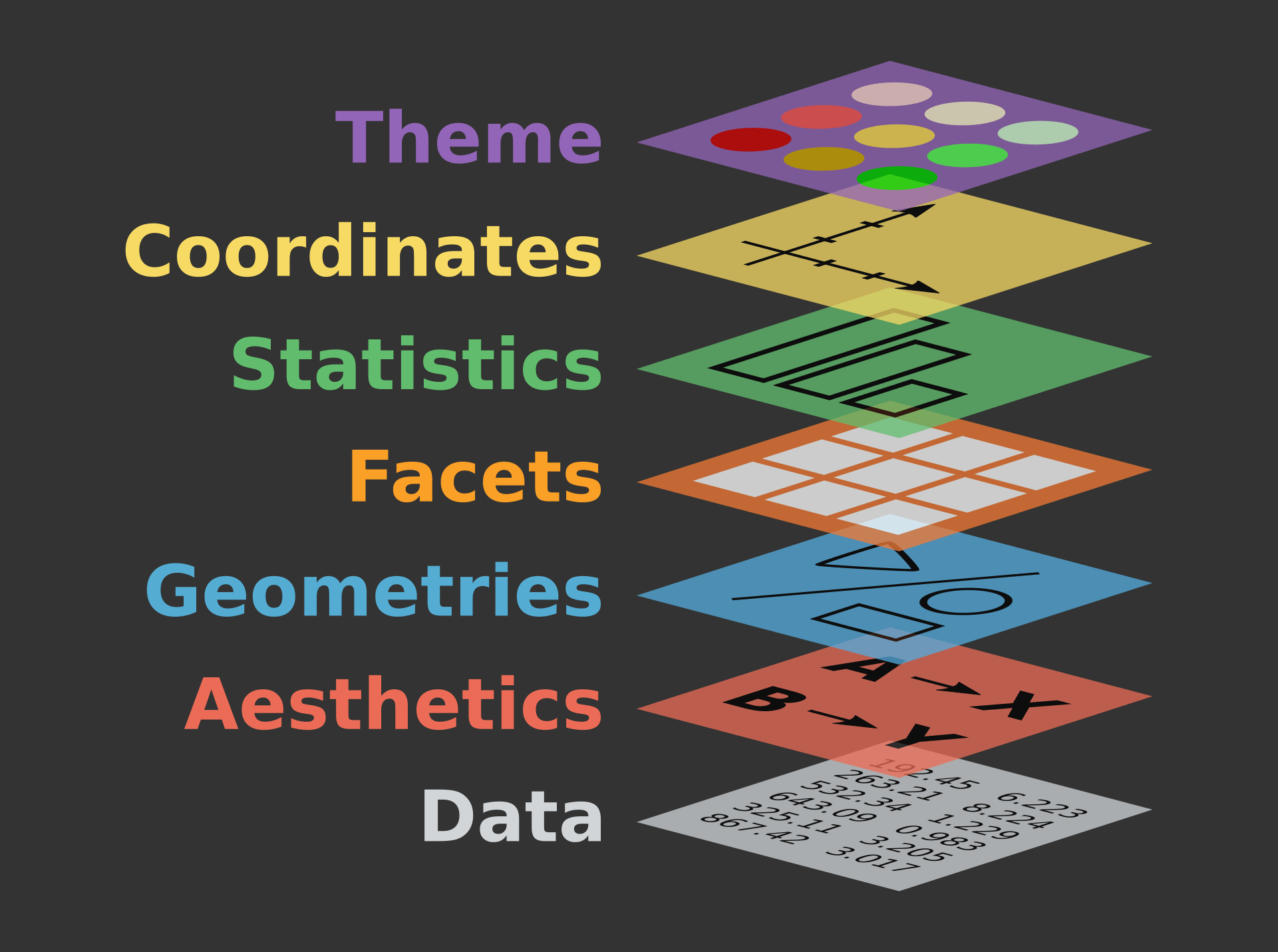
Image from The Grammar of Graphics for Introduction to data visualisation with ggplot2 QCBS R Workshop Series

Grammar of graphics

  • Data
  • Mapping
  • Statistics
  • Scales
  • Geometries
  • Facets
  • Coordinates
  • Theme

2.1 Data

  • Structure and representation of data determines what you can and can’t do with it
  • Data is expected to be in a “tidy” format (also known as long format data)

A few definitions (from Ch. 2 of R for Data Science):

  • variable: a quantity, quality, or property that you can measure.
  • value: the state of a variable when you measure it. The value of a variable may change from measurement to measurement.
  • observation: a set of measurements made under similar conditions
  • tabular data: a set of values, each associated with a variable and an observation.

What works best with the grammar of graphics is tidy data:

  • each value is placed in its own “cell”,
  • each variable in its own column, and
  • each observation in its own row.

2.2 Mapping

  • Allow data to be understood by the graphics system through:

    • Aesthetic mapping: variables -> graphical properties in the geometry
    • Facet mapping: variables -> panels in layout

2.3 Statistics

  • Data may not represent the displayed values

  • Statistics transform input variables into displayed values, e.g.

    • Counting the number of observations by category
    • Calculating summary statistics for a boxplot

2.4 Scales

  • Scales translate between value ranges and graphical properties, e.g.

    • Categories -> Colors
    • Numbers -> Position
  • Scales use a specific type of interpolation, e.g. discrete, continuous, etc., so not all scales work with all variables.

2.5 Geometries

  • How translate aesthetics into graphical representations

  • Basic geometries (e.g. points, lines, polygons) can be combined into more complex geometries (e.g. box plot, map)

  • Typically, the geometries are the same as the “type” of plot

2.6 Facets

  • Defines how data is split across multiple panels

2.7 Coordinates

  • Positional aesthetics must be interpreted by a coordinate system

  • Defines the physical mapping of aesthetics to the paper

2.8 Theme

  • Every part of the graphic that isn’t linked to the data:

    • Fonts
    • Spacing
    • Colors
    • Weights
    • etc.

3 How to to use {ggplot2} to…

  • build layered data visualizations
  • visualize spatial data

3.1 Cheatsheets

3.2 Build layered data visualizations

3.3 Setup

For this session, we are going to use the {ggplot2} and {dplyr} packages along with {sf} and {rnaturalearth}:

Code
library(ggplot2)
library(dplyr)
library(sf)
library(rnaturalearth)

3.4 Setup data

We are also going to use the storms data included with {dplyr}.

Take a quick look at storms using glimpse():

Code
glimpse(storms)
#> Rows: 19,537
#> Columns: 13
#> $ name                         <chr> "Amy", "Amy", "Amy", "Amy", "Amy", "Am…
#> $ year                         <dbl> 1975, 1975, 1975, 1975, 1975, 1975, 19…
#> $ month                        <dbl> 6, 6, 6, 6, 6, 6, 6, 6, 6, 6, 6, 6, 6,…
#> $ day                          <int> 27, 27, 27, 27, 28, 28, 28, 28, 29, 29…
#> $ hour                         <dbl> 0, 6, 12, 18, 0, 6, 12, 18, 0, 6, 12, …
#> $ lat                          <dbl> 27.5, 28.5, 29.5, 30.5, 31.5, 32.4, 33…
#> $ long                         <dbl> -79.0, -79.0, -79.0, -79.0, -78.8, -78…
#> $ status                       <fct> tropical depression, tropical depressi…
#> $ category                     <dbl> NA, NA, NA, NA, NA, NA, NA, NA, NA, NA…
#> $ wind                         <int> 25, 25, 25, 25, 25, 25, 25, 30, 35, 40…
#> $ pressure                     <int> 1013, 1013, 1013, 1013, 1012, 1012, 10…
#> $ tropicalstorm_force_diameter <int> NA, NA, NA, NA, NA, NA, NA, NA, NA, NA…
#> $ hurricane_force_diameter     <int> NA, NA, NA, NA, NA, NA, NA, NA, NA, NA…

3.5 Create a ggplot

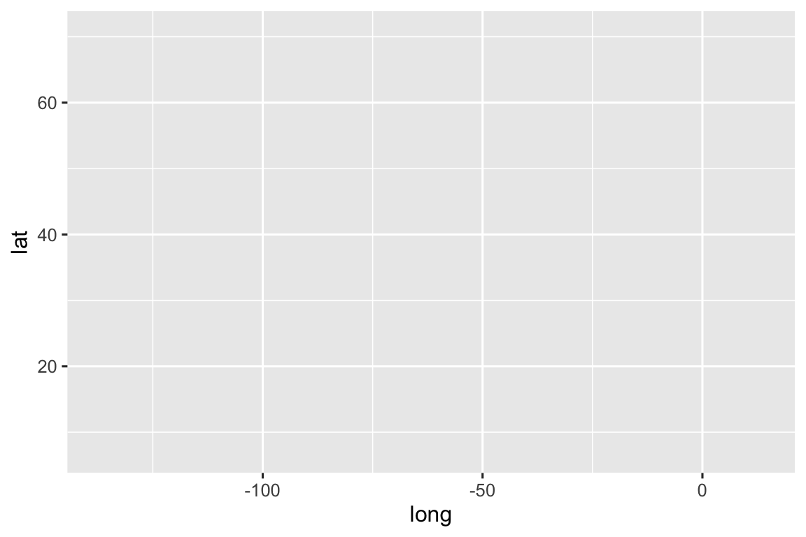
We can start by using the function ggplot() to define a plot object. Set storm as the input data for ggplot():

Code
ggplot(data = storms)

. . . ::: {.smaller} Well, that doesn’t look like much. 🤔

This is the first step in creating a plot that we can add layers to. Parameters set with ggplot() can be “inherited” by layers added later. :::

3.6 Add aesthetics and layers

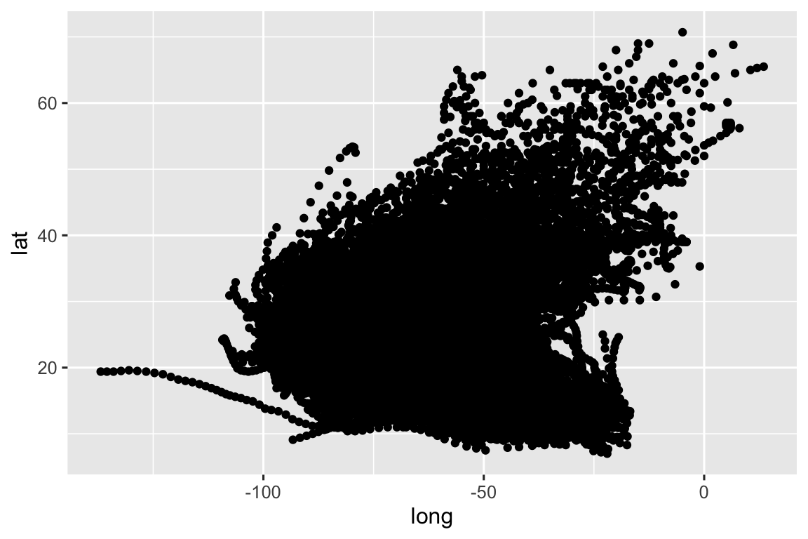
Set mapping with aes()

Next, we can set the mapping using the aes() function. We can start by mapping long (longitude) to x and lat (latitude) to y:

Code
ggplot(
  data = storms,
  mapping = aes(
    x = long,
    y = lat
  )
)

Before we can see any data, we need to tell ggplot() how we want to represent the data using layers.

Layers in {ggplot2} are most often added using “geoms” (short for geometry) functions like geom_point(), geom_col(), or geom_histogram().

Let’s give it a try using geom_point():

Code
ggplot(
  data = storms,
  mapping = aes(
    x = long,
    y = lat
  )
) +
  geom_point()

You can define the data and mapping parameters globally using ggplot() or locally for a single geom function. This code does the exact same thing as the prior block:

Code
ggplot() +
  geom_point(
    mapping = aes(
      x = long,
      y = lat
    ),
    data = storms
  )

What is this + operator?

Notice that we are combining the ggplot() and geom_point() functions using the + operator. This is a style of function or operator known as an infix operator.

Next week, we will introduce a similar function known as a pipe, %>% or |> that works to pass the output from one function (or line of code) into the next line as the first parameter in a function.

For example, see how we can use a series of pipes to operate on the storms data:

Code
storms |>
  distinct(name)
#> # A tibble: 260 × 1
#>   name    
#>   <chr>   
#> 1 Amy     
#> 2 Blanche 
#> 3 Caroline
#> 4 Doris   
#> 5 Eloise  
#> 6 Faye    
#> # ℹ 254 more rows
Code
storms |>
  distinct(name) |>
  nrow()
#> [1] 260

The prior block is the same as the following block:

Code
storm_names <- distinct(storms, name)
nrow(storm_names)
#> [1] 260

The first parameter for ggplot() is data and the first parameter for all geom functions is mapping so you often see these passed as unnnamed parameters:

Code
ggplot(storms) +
  geom_point(
    aes(
      x = long,
      y = lat
    )
  )

You can even leave off the x and y parameter names:

Code
ggplot(storms) +
  geom_point(aes(long, lat))

4 Mapping variables are not strings!

The variables passed to aes() don’t have quotes around them! This is because aes() is a data-masking (also known as a quoting function) where the inputs are evaluated in the context of the data.

TLDR: only put quotes around your aesthetic mappings when you want to pass a literal string.

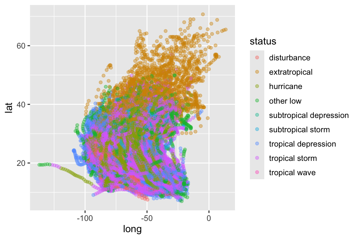
Next we can map one of the variables (status or storm classification) to an aesthetic (color):

Code
ggplot(storms) +
  geom_point(aes(long, lat, color = status))

Note that we now have a legend, added automatically when we defined a mapping to color. Since color is not a “positional aesthetic” we can’t easily interpret the meaning of the graphic without a legend, labels, or annotations.

In addition to having mapped aesthetics, we can also have “fixed” aesthetics (fixed because the same value is used for every observation in the plot). When you have a lot of overlapping features (known as overplotting), you may want to reduce the alpha (or transparency) of the features:

Code
ggplot(storms) +
  geom_point(
    aes(
      x = long,
      y = lat,
      color = status
    ),
    alpha = 0.4
  )

Fixed aesthetics should be defined for each geom—they are ignored if you pass them to ggplot().

Aesthetics can also be defined using a function. In this example, we are using the boolean operator == to compare the values from “status” to the string “hurricane”:

Code
ggplot(
  data = storms,
  mapping = aes(
    x = long,
    y = lat,
    color = status == "hurricane"
  )
) +
  geom_point()

4.1 Visualizing distributions

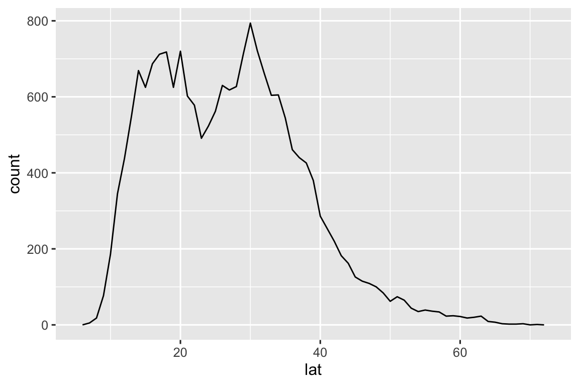
4.2 Distribution of one numeric variable

Code
ggplot(
  data = storms,
  mapping = aes(y = lat)
) +
  geom_histogram(bins = 90)

4.3 Distribution of one numeric variable

Code
ggplot(
  data = storms,
  mapping = aes(x = lat)
) +
  geom_freqpoly(binwidth = 1)

4.4 Distribution of one categorical variable

Code
ggplot(
  data = storms,
  mapping = aes(y = category)
) +
  geom_bar()

5 Visualize spatial data

To start, let’s convert our storms data set from a data frame into a sf object using sf::st_as_sf():

Code
storms_sf <- sf::st_as_sf(
  storms,
  coords = c("long", "lat"),
  crs = 4326
)

Always supply coordinates with longitude before latitude!

sf::st_as_sf() requires that you supply coordinates in lon lat order. This is also the standard order for GeoJSON files, Shapefiles, and KML files. Check out lon lat lat lon by Tom MacWright for more information.

Finally, we can look at these observations on a map:

Code
ggplot(data = storms_sf) +
  geom_sf(aes(color = status))

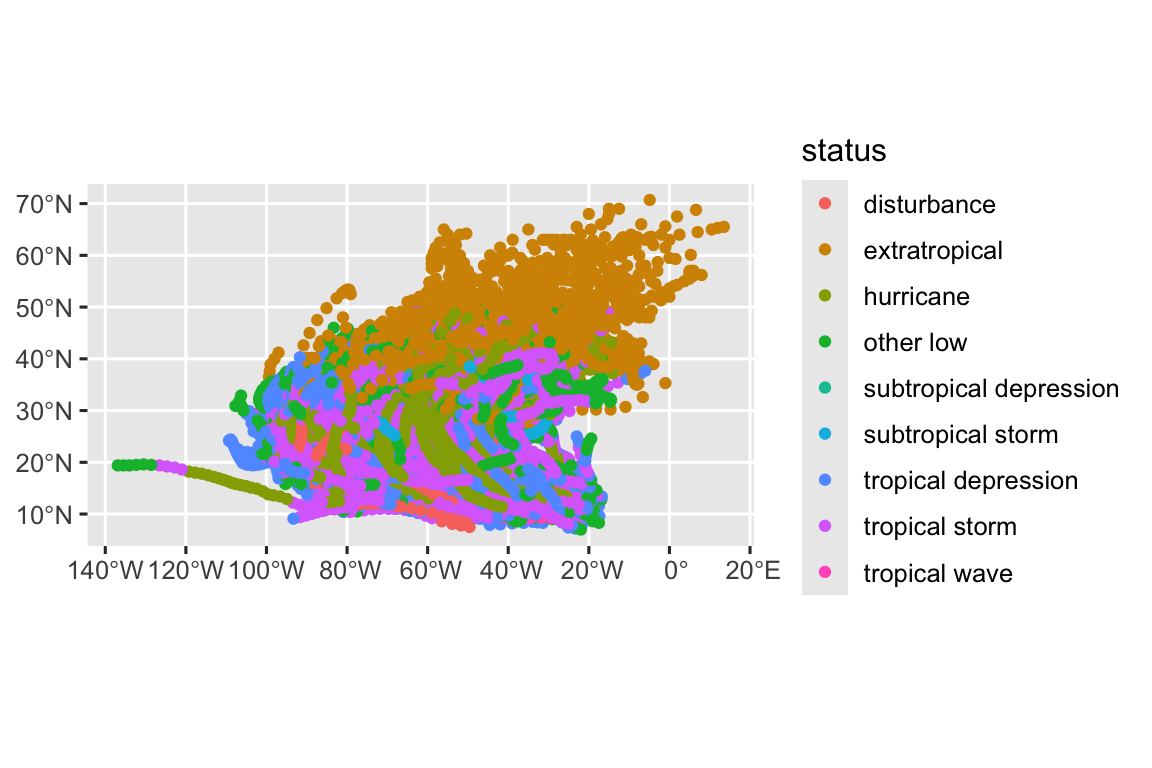
That first map may not look much different.

But converting the data to a sf object allows us to use coord_sf() to transform the coorindate reference system on the fly:

Code
ggplot(data = storms_sf) +
  geom_sf(aes(color = status)) +
  coord_sf(crs = "EPSG:3035")

This is equivalent to converting the coordinate reference system in advance using st_transform():

Code
storms_sf |>
  st_transform(2804) |>
  ggplot() +
  geom_sf(aes(color = status))

Note, that this is another example of how we can use the pipe (|>) to move data between functions in R.

However, to really show the potential, we need some more data. Install and load the {rnaturalearth} package and then load data for the coastline and countries:

Code
# pak::pkg_install(c("rnaturalearth", "rnaturalearthdata"))
library(rnaturalearth)

coastline <- ne_coastline()

countries <- ne_countries()

Put them together and we are starting to get somehwere:

Code
ggplot() +
  geom_sf(data = storms_sf, aes(color = status)) +
  geom_sf(data = coastline, color = "white")

But the map is zoomed out to show the whole world—not just the north Atlantic storm observations. We can use the xlim and ylim parameters of coord_sf() to “zoom” in on a smaller area:

Code
storms_bbox <- storms_sf |>
  st_transform("EPSG:3035") |>
  st_bbox()

storms_map <- ggplot() +
  geom_sf(data = countries, fill = "white") +
  geom_sf(data = storms_sf, aes(color = category), alpha = 0.3) +
  geom_sf(data = coastline, color = "black") +
  coord_sf(
    xlim = c(storms_bbox$xmin, storms_bbox$xmax),
    ylim = c(storms_bbox$ymin, storms_bbox$ymax),
    crs = "EPSG:3035"
  )

storms_map

Try adding a scale:

Code
storms_map <- storms_map +
  scale_color_distiller(type = "seq", direction = 1, palette = "YlOrRd", na.value = "gray60")

storms_map

Now try adding some labels:

Code
storms_map <- storms_map +
  labs(
    title = "Atlantic hurricanes by category, 1975-2021",
    caption = "Data: NOAA Atlantic hurricane database best track data via the {dplyr package}"
  )

storms_map

Lastly, we can adjust the theme:

Code
storms_map +
  theme_minimal() +
  theme(
    legend.position = "bottom"
  )

“It’s true that there are better and worse ways to make a map but no one way to make an excellent map.”

Gretchen N. Peterson in GIS Cartography: A Guide to Effective Map Design

What makes a bad map bad?

For new map makers who might not know any better, it is often:

  • Confusing or distracting layout
  • Not enough color contrast for features
  • Cluttered labels, legends, or features

What makes a fine map just fine?

For more experienced map makers who might be in a hurry:

  • Not enough thought on font sizes and styling
  • No feature generalization (simplifying geometry where appropriate for the map scale or subject)
  • Inappropriate color scales

Other cartography considerations

But there are also some cartographic considerations that apply to maps in special and important ways:

  • Feature geometry (and cartographic conventions)
  • Projections
  • Scaling